My First UI Design Project: Building A Photography Portfolio Website
As a hopeless romantic, I’m always dreaming about the day of my wedding and everything prior to that special day. I can only imagine how stressful wedding planning can be. When I think about the checklist, there’ll always be a wedding photographer right at the top.
As a freelance photographer myself, I wanted to use this opportunity to learn about the mistakes photographers make when building their portfolio for their business. I wanted to build a site that would help visitors know if I was the right wedding photographer for them and then encourage them to book my services.
The Problem
There are quite a few mistakes wedding photographers make when they’re building a portfolio site for their business. The biggest mistakes I’ve seen are the ones that lack delivering the right content. Some wedding photographers don’t showcase featured galleries or portfolios which is a BIG mistake because their site is where they attract potential clients. I’ve also stumbled on a few sites that have a weak home page because it doesn’t communicate its entire purpose. I believe it’s so important to have the home page stand out because it’s what will grab the visitor’s attention first. It’s a place where you convince your visitors to stay longer.
I found that there are a number of common mistakes on this kind of site:
- Confusing or missing navigation
- Lacking content
- Weak home page
- No clear call-to-action buttons
- No featured galleries or portfolios
- Lack of mobile responsiveness
My Goals
I had a few goals in mind when I began creating a portfolio website for myself. First, I wanted to figure out what attracts potential clients to stay on the website. Then I wanted to make sure the site was easy to navigate. Last, I wanted to combine all the qualities a visitor would look for when looking up potential wedding photographers.
My Audience
The target audience for my site are newly engaged couples, elopement couples, and the soon-to-be bride & groom. You’ll find out why I made the decision to include additional engagement and elopement services as you continue to read about my process.
Research
I approached this step by meeting with a professional wedding photographer and conducting user research using survey monkey to gather feedback on the sort of features and information the website should have. A special thanks to Chase Lanier, who has also been my mentor in the photography world, he helped me come up with questions that could determine exactly what to include on my website. He also suggested that most wedding photographers add additional services such as engagement, couple and elopement services. By adding additional services, I’m not restricted to one service and ultimately, I can bring in more clients. It also helps create a stronger portfolio to showcase to potential clients. I created a survey using survey monkey and sent it out to 6 of my friends who are currently in a relationship and/or engaged.
My Findings
Here's what I learned:
If a visitor can’t find what they’re looking for, s/he will leave your site and you basically lost a potential client. More than half of my respondents agreed that a home page with a “wow” effect and a portfolio that evokes emotion keeps them engaged to continue browsing through the site. Which brings me back to problem solve the few mistakes a photographer makes such as having a weak home page and no featured galleries/portfolios.
100% of my respondents agreed that it’s important for the photographer to have an about page. This helps visitors learn who is behind the camera and creates a better relationship between the client and the photographer.
Pricing plays a huge part in making a decision. In addition, more than half agreed that the photographer’s editing style + their work is important as well. Every photographer’s work is different and has their own specific editing style so it’s important that a potential client understands to look for these things before hiring.
An FAQ (frequently asked questions) page is necessary because it can save a lot of time between the photographer and the client. Even in my experience, photographers tends to get asked the same questions so having them displayed on their site helps the potential client find information faster without having to wait for a response.
Testimonials are helpful because it helps potential clients know if past experiences with the photographer hasbeen good or not. Feedback is so important in every business, even in the photography world!
My audience loves candid photos. Not only did 100% of my respondents agree that candid photos are better but even in my experience as a photographer, candid photos have always turned out to be the best kind of photos. When a photo isn’t staged or posed, it creates a better experience and you can look back and remember exactly how the moment was. You remember every emotion/feeling when it was captured.
Users leave a website for a number of reasons. My respondents chose poor/confusing navigation, not showcasing enough work and expensive prices to be the important factors of why a potential client would leave the website. Looking back at some of the previous answers I got, this makes sense. Why on earth would a visitor stay on the site if they can’t find what they’re looking for? Ultimately, the wedding photographer has one chance to get it right on the special day so not having enough work to showcase the photographer’s creative talent doesn’t help them know if s/he has the kind of skills they’re looking for. Most couples also tend to have a budget, so hiring a photographer who is out of their price range could mean sacrificing something else in their wedding.
Main Takeaways
The most important thing that appealed to my respondents was a clear structure, easy navigation, while the things that turned my respondents away were not showcasing enough work, poor/confusing navigation and pricing (100% of my respondents).
Proving SEO
I also found that SEO (Search Engine Optimization) is very crucial for a photographer’s website. There are a lot of ways to improve SEO, but these are the ones I found crucial to my project:
- Using alt tags in images. Alt tags describe an image for the benefit of visually impaired users, users who use text-only browser, or users who have turned off images.
- Optimizing all images before uploading them onto the site. Don’t upload high resolution images or images at their original size! Doing so could slow down the website.
- Creating content with your viewers in mind. Content should be informative, relevant, timely and entertaining in order to attract viewers.
- An SEO-friendly home page using calls to action to encourage visitors to visit subpages. This could include showing your latest work and bio, plus your social networks to drive traffic to those platforms. Using full-screen sliders and headlines also make for a better experience for your user.
- Making the site mobile-friendly. Internet usage has increased more 600% since 2010, so there’s a good chance many of your users will use a phone or tablet to access your site. You should be sure it works on all formats.
A great resource for SEO is Everything a Photographer Needs to Know About SEO by Nata Leo. Michelle Hummel also has a great blog post explaining it.
Establishing User Flow
During this phase, I was able to establish the flow of how the visitor will navigate through the website based on each response from the survey. This also helped me figure out how to structure my content when it came to the design process.
The navigation links shifted from:
- Work
- About
- Pricing
- Testimonials
- Blogs
- FAQ
- Contact
to these links:
- Work
- About
- Investment — changed from “pricing” to “investment”
- Testimonials
- FAQ
- Contact
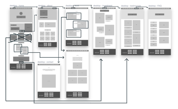
The home page was going to include
- Full page slider
- About section
- Recent work section
- Investment section
then it changed to
- Full page slider
- About section
- Recent Work section
- Testimonials (you’ll see why I decided to replace investment with testimonials below)
Some Tough Decisions
With so many design inspirations on the web, I had to think strategically how I wanted to structure my content.
- Initially I was going to keep minimal content on the home page to prevent the visitor from scrolling too much. I found that I can add more content, as long as the content is relevant and encourages the visitor to want to learn more about the photographer.
- Another tough decision was whether I should combine the blog page with the photography work. Initially these were going to be 2 different pages. With SEO and image optimization in mind, I figured since I am already displaying a gallery on the blog, there is no need to have a separate page dedicated to just a gallery since the blog itself is the representation of the photographer’s work. In conclusion, I am combining love stories & work into one destination — work.
- A separate contact page — I was going to have a contact form be on the home page but I decided to have it on a separate page instead for consistency.
Structuring the Content
The responses from my survey helped me determine how to implement them into the design process. Here’s what I will include for each page.
Home Page
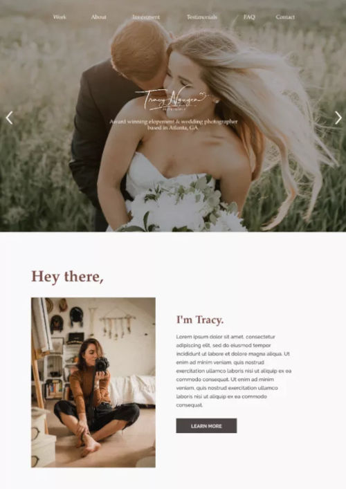
- Q1 revealed that a home page with a “wow” effect and a portfolio that evoke emotions will encourage the visitor to continue browsing. To create that “wow” effect, I’m adding a full page gallery slider on the home page. It’ll be the first thing the visitor will see. That “wow” effect is what tends to grab his/her attention first and a strong portfolio helps make the photographer stand out and forms a stronger connection.
- In addition to the home page, Q2 revealed that the photographer should include an about section. I incorporated this during my wireframe process which will take the visitor to a whole new page dedicated about the photographer.
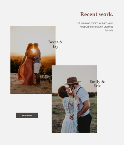
- After the about section, I decided to include a recent work section which would display the latest work from previous clients. Then there will be a “view more” button that essentially takes the visitors to the portfolio page which consists of blogs about past clients.
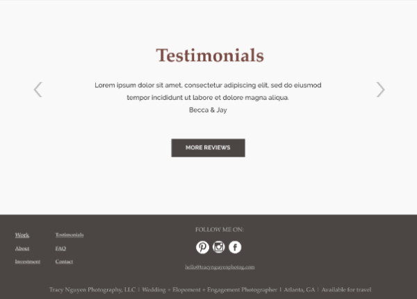
- The last thing the visitor will see on the home page are a few testimonials. To have a few testimonials displayed on the home page gives the visitor a glimpse what past client’s experiences have been like with the photographer.
Work( Portfolio) Page
- This page is where visitors will get a sense of how the photographer will capture their special day. It will consist of blogs from previous clients and in each blog will include the experience along with a gallery.
About Page
- Wanting to still have that “wow” effect, I made the decision to include a self portrait of the photographer as a hero image. As the visitor continues to scroll down, s/he will learn more about the photographer.
Investment Page
- This page will include wedding, engagement, and elopement services with prices listed. I researched standard pricing based on the average cost of what photographers around my area charge for these services. This page could have been called pricing or investment but I went with calling it “investment” because weddings aren’t cheap and couples are investing a lot of money for this type of luxury.
Testimonials Page
- I wanted to dedicate a whole page to testimonials because this will encourage the visitors to continue browsing through the site and read more about past experiences with the photographer.
FAQ Page
- This page makes it easier for potential clients to find quick information. I researched common questions photographers receive and implemented them into my project.
Contact Page
- Last but not least, a contact page! The contact page is SO important because if a visitor can’t find a way to contact you, you could lose them as a potential client. It will consist of a form which asks specific questions about the client’s inquiry. I researched what questions should be asked to make sure the photographer has all necessary information.
Mocking Up the Design
I began sketching out the wireframes to determine which features and elements are wanted and needed and incorporating any additional tools that might offer better usability. Then I fleshed out my wireframes to move closer to the final product. For this, I used InVision Studio, a great free product.
Based on feedback, I decided to remove the Investment section on the home page and replace it with a testimonial section. Now the home page consists of the full-screen slider, an about section, recent work section and testimonial section.
The footer will include:
- Social links
- Links to every page on the site.
- The photographer’s email incase they do not want to fill out the contact form
- A short description for the copyright (Tracy Nguyen Photography, LLC | Wedding + Elopement + Engagement Photographer | Atlanta, GA | Available for Travel)
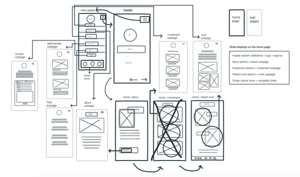
Wireframe A for mobile
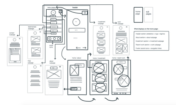
Wireframe B for mobile
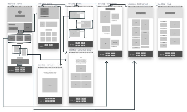
Wireframe A for larger screens
Final Design
My approach with the final design was to keep it clean, modern and intuitive.
Wanna see the live interactions? Check it out on my website.
This blog post was written by Tracy Nguyen, a student in our Immersive program, and was first published on Medium.

DigitalCrafts is part of the American InterContinental University System. Not all programs are available to residents of all states. See the Accreditation and Licensure section for information on the agencies that approve and regulate the school's programs.
View complaint information
2200 East Germann Road, Suite 100 · Chandler, AZ 85286